Top stories in Newfoundland and Labrador

Schrödinger's House (of Assembly) cat: N.L. shelter standards expected by June
Updated 13 hours ago
|5 min read

UPDATED: Thanks for the memories, Bob: Newfoundland hockey broadcaster Bob Cole has died at age 90
Updated 11 hours ago
|10 min read

Supreme Court of Canada to hear travel ban appeal of Newfoundlander
Updated 13 hours ago
|2 min read
Team Gushue Highway completion held up by several factors, including bureaucracy
Updated 12 hours ago
|3 min read
From a little boy 'succeeding with everything he did' to an addict: N.L. mom desperate to get help for her son
Updated a day ago
|13 min read
Local
More
RNC surrounds house, negotiates with individual inside
Updated 2 hours ago
|1 min read

Happy Valley-Goose Bay man charged with child luring
Updated 7 hours ago
|1 min read

New Brunswick woman honoured to take part in National Day of Mourning event in Corner Brook
Updated 9 hours ago
|7 min read
Ambassadors from Baltic nations Lithuania, Lativa, Estonia visit St. John's, Goose Bay airbase
Updated 11 hours ago
|4 min read
‘Emotionally I have been broken,’ said N.L. social worker assaulted by a teen she was working with
Updated 12 hours ago
|5 min read
Opinion
More
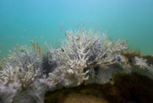
GWYNNE DYER: Arctic seals and coral reefs facing extinction, but every little bit helps
Updated a day ago
|4 min read
LETTER: Justice and science in public health policy needed as federal government hikes taxes for vaping
Updated a day ago
|3 min read

LETTER: Carbon tax is simply another irrational decision by the current government to further burden all of us
Updated a day ago
|8 min read
BOB WAKEHAM: Battles between N.L. premiers and Ottawa nothing new
Updated a day ago
|7 min read
Business
More
'We brought The Seed Company into the 21st century': St. John's-based business prepares to celebrate 100 years
Updated a day ago
|7 min read

All fuel prices drop in Newfoundland and Labrador overnight Thursday, April 25
Updated a day ago
|1 min read

Prices at the Pumps: Some small relief, more for diesel
Updated a day ago
|1 min read
Construction boom hits Moncton in first quarter of 2024
Updated a day ago
|2 min read
Union to launch boycott of Java Blend coffee shops in Halifax
Updated a day ago
|3 min read
Lifestyles
More
'People from all walks of life and all age groups' love off-roading in N.L., say enthusiasts
Updated 9 hours ago
|7 min read

‘A personal choice’: More Canadians seeking medical assistance in dying
Updated a day ago
|7 min read

PAUL SMITH: What's the best bet for raincoats? Plenty of good options for outdoor enthusiasts in N.L.
Updated a day ago
|9 min read
ERIN SULLEY: Never underestimate the power of a slow cooker in the kitchen – check it out by making this slow cooker apple pork
Updated Apr. 24, 2024
|6 min read
JOAN SULLIVAN: Crisp and evocative writing in Donna Morrissey’s seventh novel, 'Rage the Night'
Updated Apr. 24, 2024
|5 min read
Sports
More
On the ice with the pros: Mount Pearl girl hits ice as an anthem skater for PWHL game in Ottawa
Updated a day ago
|4 min read

Brad Marchand's antics driving Leafs and their coach batty: 'It's an art and he's elite at it'
Updated a day ago
|6 min read

Baseball NL wants more players and communities to 'Step Up to the Plate'
Updated a day ago
|2 min read
Host Mount Pearl Blades win 2024 Don Johnson Memorial Cup opener
Updated Apr. 24, 2024
|4 min read
Atlantic All-Star event in Halifax will showcase the region's top female basketball players
Updated Apr. 23, 2024
|4 min read
Canada
More
'I thought this was an easy transfer': Cape Breton man recounts agonizing wait for mental health treatment
Updated 56 minutes ago
|7 min read

Guilty verdict entered in second-degree murder case in Cape Breton
Updated 1 hour ago
|4 min read

Two Whycocomagh area roads to receive major repairs this year
Updated 1 hour ago
|1 min read
Canada's British Columbia scraps program to allow drug use in public spaces
Updated 1 hour ago
|1 min read
Person found dead in wooded area in Cape Breton: Police
Updated 1 hour ago
|1 min read
World
More
Kristi Noem, a Trump VP contender, defends killing dog on family farm
Updated 57 minutes ago
|2 min read

US Air Force awards Doomsday plane contract to Sierra Nevada
Updated 7 minutes ago
|1 min read

Stranded ships exit Baltimore port via temporary channel
Updated 1 hour ago
|2 min read
Netherlands will consider resuming support to Palestinian UNRWA agency
Updated 2 hours ago
|1 min read
Taiwan rattled by quakes again, no immediate reports of damage
Updated 2 hours ago
|1 min read
Recent Stories


Independent living during mental health challenges: Dartmouth housing project underway
Updated 3 minutes ago
|4 min read
Lawyers for Russia's deputy defence minister appeal his pre-trial detention, TASS reports
Updated 37 minutes ago
|1 min read
US regulators set to seize Republic First Bancorp, WSJ reports
Updated 7 minutes ago
|1 min read
THE BOOK SHELF: Patient advocate helps readers navigate health-care system
Updated 6 hours ago
|7 min read