Top stories in Newfoundland and Labrador

'Exceptional in every way’: Hundreds attend Bob Cole's funeral in St. John’s
Updated a day ago
|4 min read

Trio accused of kidnapping St. John's teenager expected to enter pleas next month
Updated a day ago
|2 min read

Accused murderer Ibrahim Al Ahmad returns to St. John's court
Updated a day ago
|2 min read
Forensic DNA expert, police tech investigator testify as Chris Carter's sexual assault trial continues in St. John's
Updated a day ago
|3 min read
'War against income inequality': Why these N.L. shoppers are joining the Loblaws boycott
Updated a day ago
|4 min read
Local
More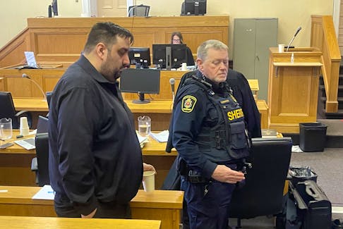
Trio accused of kidnapping St. John's teenager expected to enter pleas next month
Updated a day ago
|2 min read
Accused murderer Ibrahim Al Ahmad returns to St. John's court
Updated a day ago
|2 min read

Comedian and TV star Rick Mercer returns to hometown to be honoured as 2023 inductee of Canada's Walk of Fame
Updated a day ago
|7 min read
'Exceptional in every way’: Hundreds attend Bob Cole's funeral in St. John’s
Updated a day ago
|4 min read
Two men arrested after attempted ATV theft and Bonavista business break-in
Updated a day ago
|2 min read
Opinion
More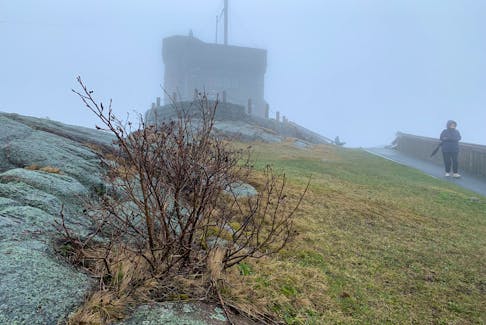
PAM FRAMPTON: Wake me up when spring comes
“The day is cold, and dark, and dreary It rains, and the wind is never weary…”
From “The Rainy Day” by Henry Wadsworth Longfellow
The evergreens across the road have been rendered into shadowy versions of themselves by a bank of low fog that’s ...
Updated May. 2, 2024
|5 min read
GWYNNE DYER: 'The second time as farce' – is history repeating itself?
Updated May. 2, 2024
|6 min read

COMMENTARY: Newfoundland and Labrador’s population is growing fast and homebuilding isn’t keeping up
Updated May. 2, 2024
|3 min read

LETTER: N.L. government isn't representing the interests of the people and nature with approval of hydrogen projects
Updated May. 2, 2024
|5 min read
LETTER: Keels was featured in 'The King Tide,' but community has important history in N.L.
Updated May. 1, 2024
|3 min read
LETTER: How a failed laser eye surgery changed my life
Updated Apr. 30, 2024
|3 min read
Business
More
Furey says any potential deal on Churchill Falls will be debated and voted on in House of Assembly
Updated May. 3, 2024
|3 min read

Prices at the Pumps: Explaining recent pump fluctuations
Updated a day ago
|1 min read

THE WRAP: TikTok kids crazy, Loblaw boycott lazy and Bargain Harley’s checks out
Updated a day ago
|4 min read
Atlantic Canadian post-secondary institutions awarded nearly $10M to commercialize research
Updated a day ago
|1 min read
Foxconn reiterates Q2 revenue to grow, posts record April sales
Updated 1 hour ago
|2 min read
Lifestyles
More
Blink breaks and other ways to work at a computer without causing strain, pain or injury
Updated May. 2, 2024
|5 min read

Changing with the seasons: Atlantic Canadian mothers share their budgeting tips for getting kids new summer clothing
Updated May. 2, 2024
|6 min read

ERIN SULLEY: How to make the perfect homemade treats for your favourite pup
Updated May. 1, 2024
|6 min read
‘All these skills have majorly impacted my adult life’: Atlantic Canadians discuss teaching children life skills
Updated May. 1, 2024
|8 min read
JOAN SULLIVAN: New cookbook by Bobbi Pike offers tips on how food can be comfort without guilt
Updated May. 1, 2024
|5 min read
Sports
More
A future imagined: Paradise teen makes his hockey commentary debut at Royal Newfoundland Regiment memorial tournament
Updated May. 1, 2024
|3 min read

‘Don’t hesitate to try this sport’: Atlantic Canadians endorsing the resurgence of badminton
Updated Apr. 30, 2024
|6 min read

DOJO: Mount Pearl, St. John’s reached the semifinals at 2024 Don Johnson Memorial Cup
Updated Apr. 27, 2024
|2 min read
On the ice with the pros: Mount Pearl girl hits ice as an anthem skater for PWHL game in Ottawa
Updated Apr. 24, 2024
|4 min read
Baseball NL wants more players and communities to 'Step Up to the Plate'
Updated Apr. 25, 2024
|2 min read
Canada
More
Man, 18, dead after crash in Upper Stewiacke
Updated 14 hours ago
|1 min read

15-year-old youth dead, two injured after two ATVs crash in Beresford, N.B.
Updated 15 hours ago
|2 min read

India waits for details on arrests in Canada over Sikh separatist's murder
Updated 16 hours ago
|2 min read
Former Acadia prof Rick Mehta charged with intimidating justice system participant in latest alleged bail violation
Updated 22 hours ago
|2 min read
Attempted murder, arson charges adjourned again for P.E.I. man
Updated a day ago
|2 min read
World
More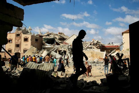
Russian attacks on Ukraine energy system caused $1 billion in damages - minister
Updated 24 minutes ago
|1 min read

On Orthodox Easter, Zelenskiy calls on Ukrainians to unite in prayer
Updated 1 hour ago
|2 min read

Russia blames Baltic countries for the severing of most ties
Updated 3 hours ago
|1 min read
Panamanians vote in crowded field of presidential contenders
Updated 4 hours ago
|2 min read
Putin attends Easter service led by head of Russia's Orthodox Church
Updated 4 hours ago
|2 min read
Recent Stories
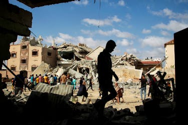
Gaza ceasefire talks continue in Cairo, Israel pounds the Palestinian enclave
Updated 14 minutes ago
|2 min read

Russian attacks on Ukraine energy system caused $1 billion in damages - minister
Updated 24 minutes ago
|1 min read
RICK MacLEAN: The girdle offered me a pregnancy lesson
Updated a day ago
|4 min read
Bruins end Leafs' season with OT win in Game 7
Updated 44 minutes ago
|2 min read
MLB roundup: A's hang 20 runs on Marlins
Updated 54 minutes ago
|7 min read