Classic Blue is the Pantone colour of the year 2020, and it’s an easy one to work with, say Vancouver interior designers Sarah Gallop of Sara Gallop Design Inc. and Sydney Carlaw of Purity Designs Inc.
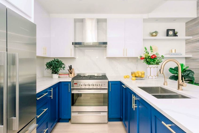
“I see it almost as a neutral. It offers great contrast against a crisp white and warms a space much more than a grey would,” says Gallop.
This blue pairs beautifully with metals, she says, complementing brass, black, chrome and polished nickel, and works in both traditional and contemporary spaces.
Classic Blue is a good colour choice for people who don’t normally gravitate toward colour, says Carlaw. It can be used for a kitchen island or cabinetry, or in a laundry or powder room.
“It’s fresh. It has a natural element and it’s timeless,” she says.
Carlaw adds that if you don’t feel like adding this colour to your home in a permanent way, you can simply decorate with it using throw cushions or kitchen accessories (think Le Creuset’s fun colour options).
Copyright Postmedia Network Inc., 2020

